Product Rebrand | UX/UI Strategy
From Snack Factory To Pretzel Farm
A Crunch Worthy Rebrand

Tools
Research
Timeline
February 2025
Overview
Snack Factory Pretzel Crisps has long been a pantry staple, but its branding no longer reflected the boldness and quality of the product itself. This rebrand preserves its recognizable identity while modernizing its look and feel.
The result? A comprehensive, market-ready branding package designed to enhance sales performance and establish Pretzel Crisps as a strong, lasting presence in the snack aisle.
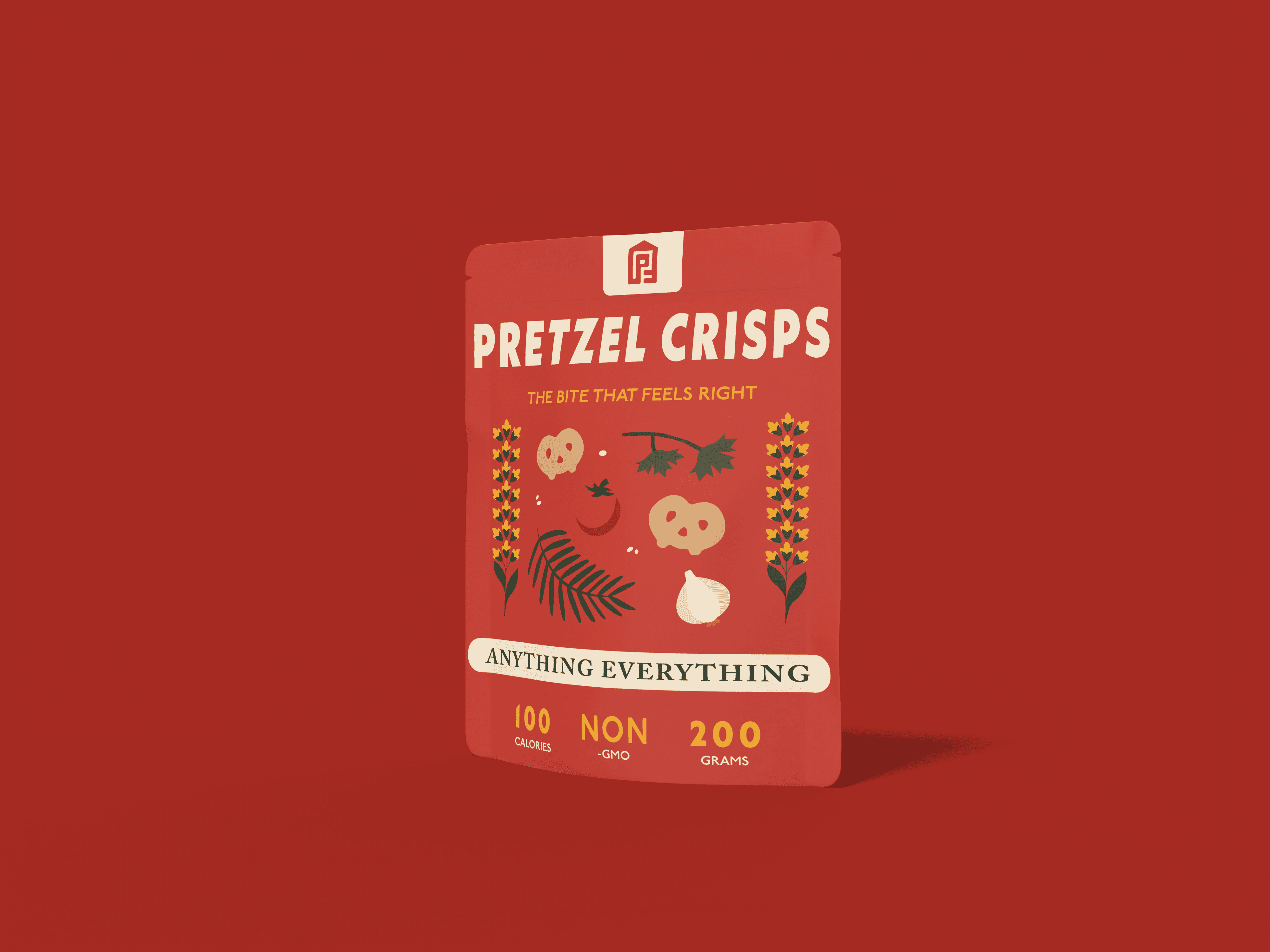
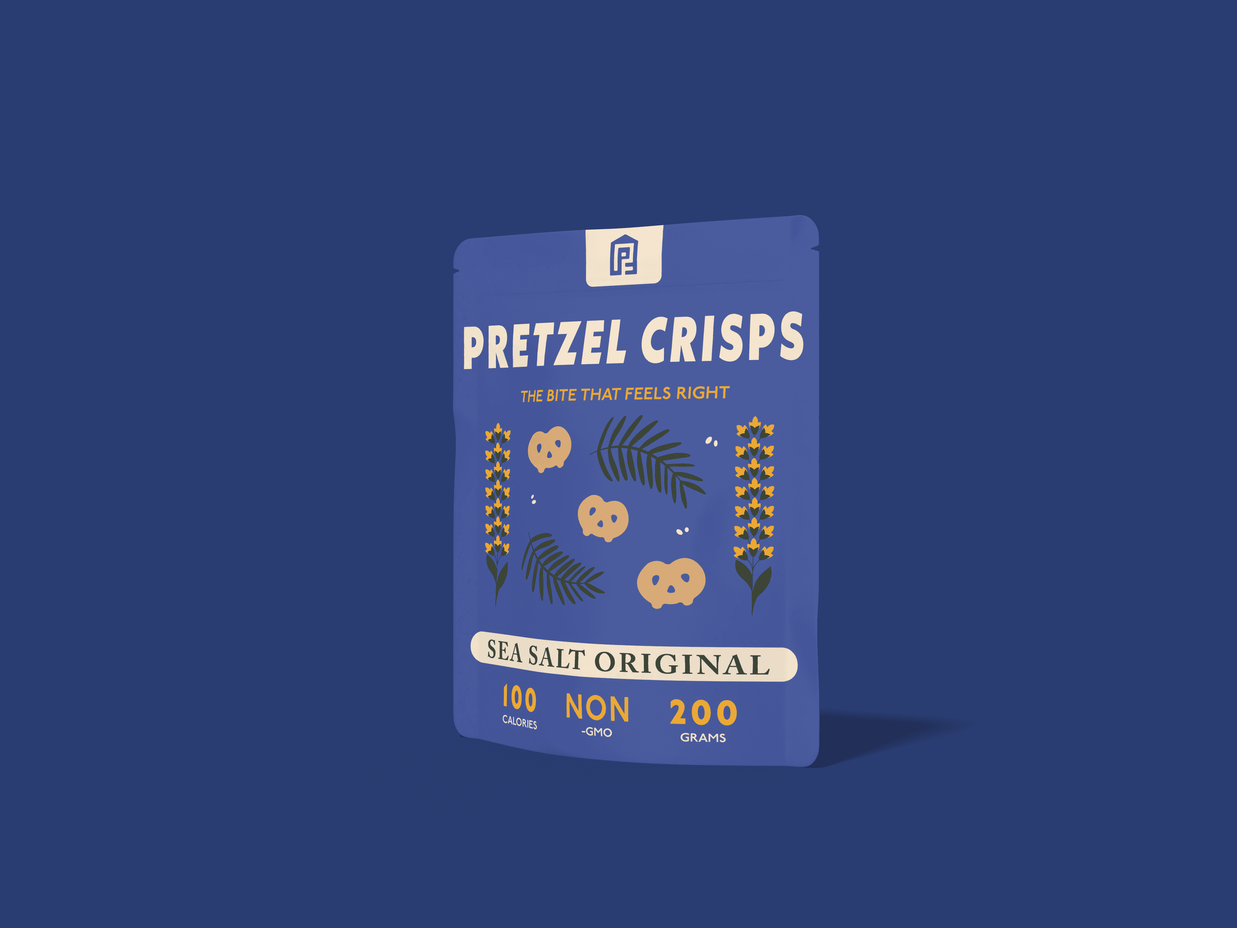
[Multiple concepts explored; Figure 2 reflects the chosen concept]
Understanding The Existing Brand
To build a solid foundation for the redesign, I conducted an in-depth brand analysis of Snack Factory’s Pretzel Crisps. This process allowed me to explore strategic directions that would enhance the brand’s identity and market presence.

What Does Pretzel Crisps Feel Like?
Bold, crisp, versatile, and crafted.

What Could I Highlight?
Artisnal quality, fresh-farm appeal, and simplicity.

What Is Pretzel Crisps?
It's more than a snack, it's an experience.
The Market
Snack Factory had a strong product but suffered from cluttered branding and a lack of emotional connection. To break through the stagnation, I aimed to craft a cohesive identity that resonates with health-conscious consumers in their late 20s to 30s.
Testing The waters
Market research revealed that Pretzel Crisps' value proposition laid in its crisp texture and versatile use. The rebrand needed to elevate these aspects while reinforcing a more modern image.
Instead of incremental changes, I chose to take a bold approach: reimagining the brand from the ground up to create a clearer and more memorable identity.
The Game Changers
New Name & Identity

Refined Visual System

Updated Story
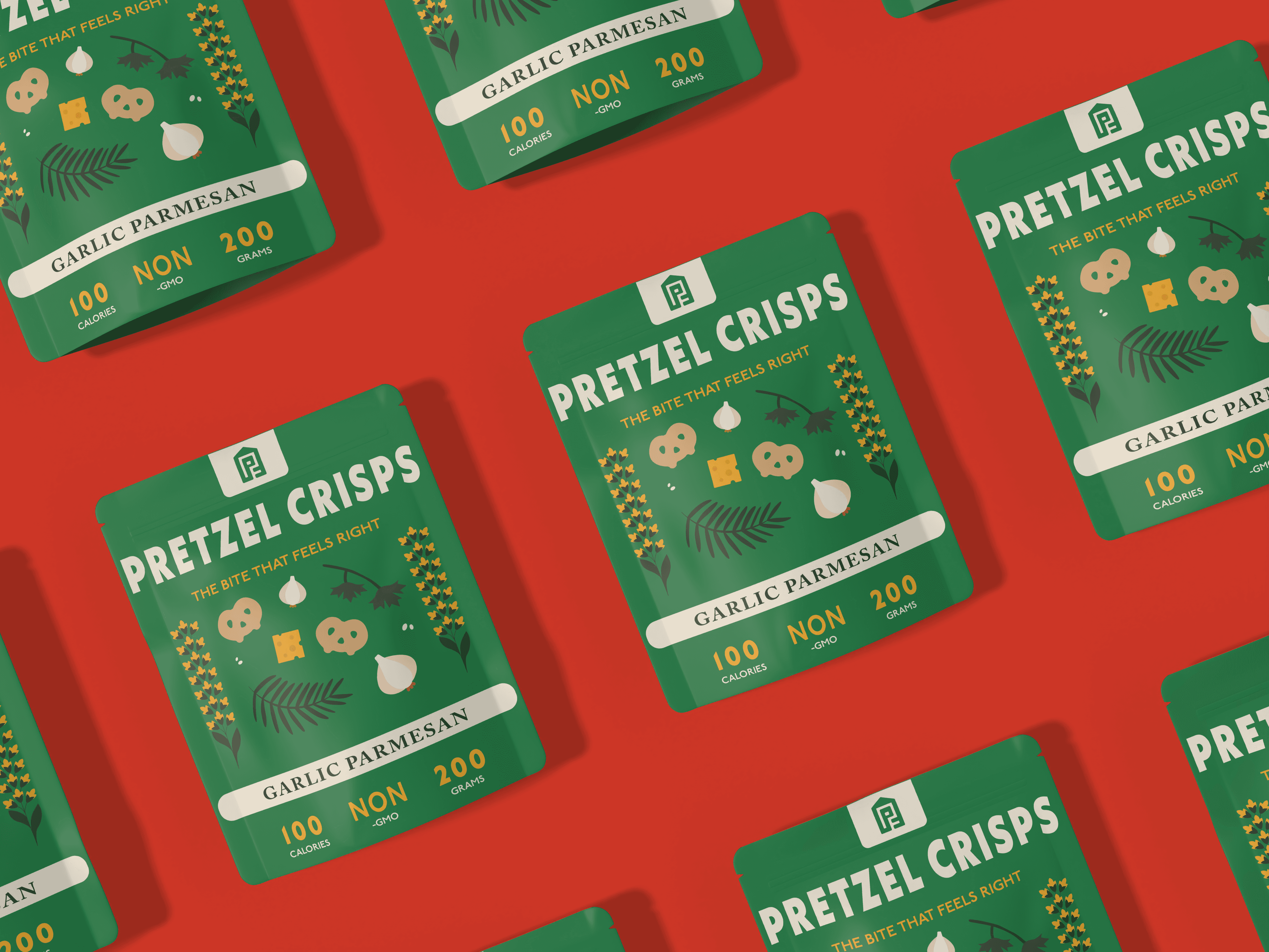
A NEW NAME & IDENTITY?


[Multiple concepts explored; Figure 2 reflects the chosen concept]

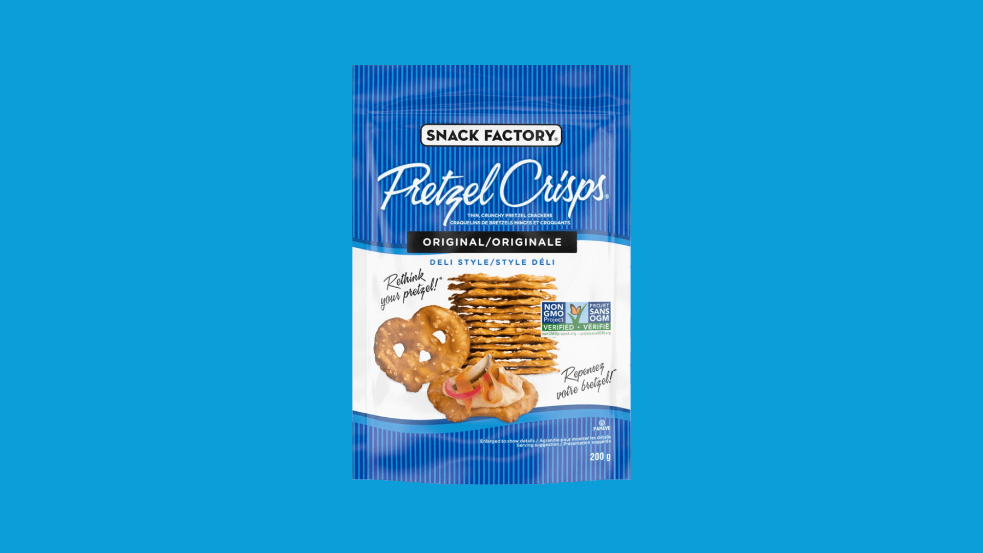
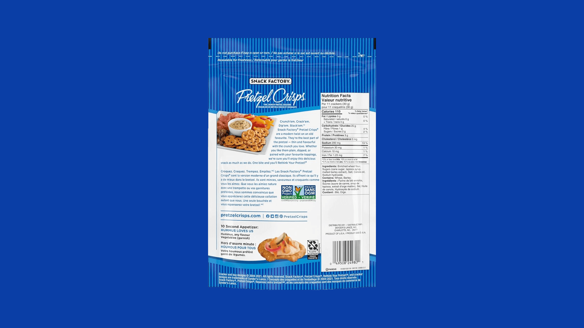
[Old Logo; Snack Factory]


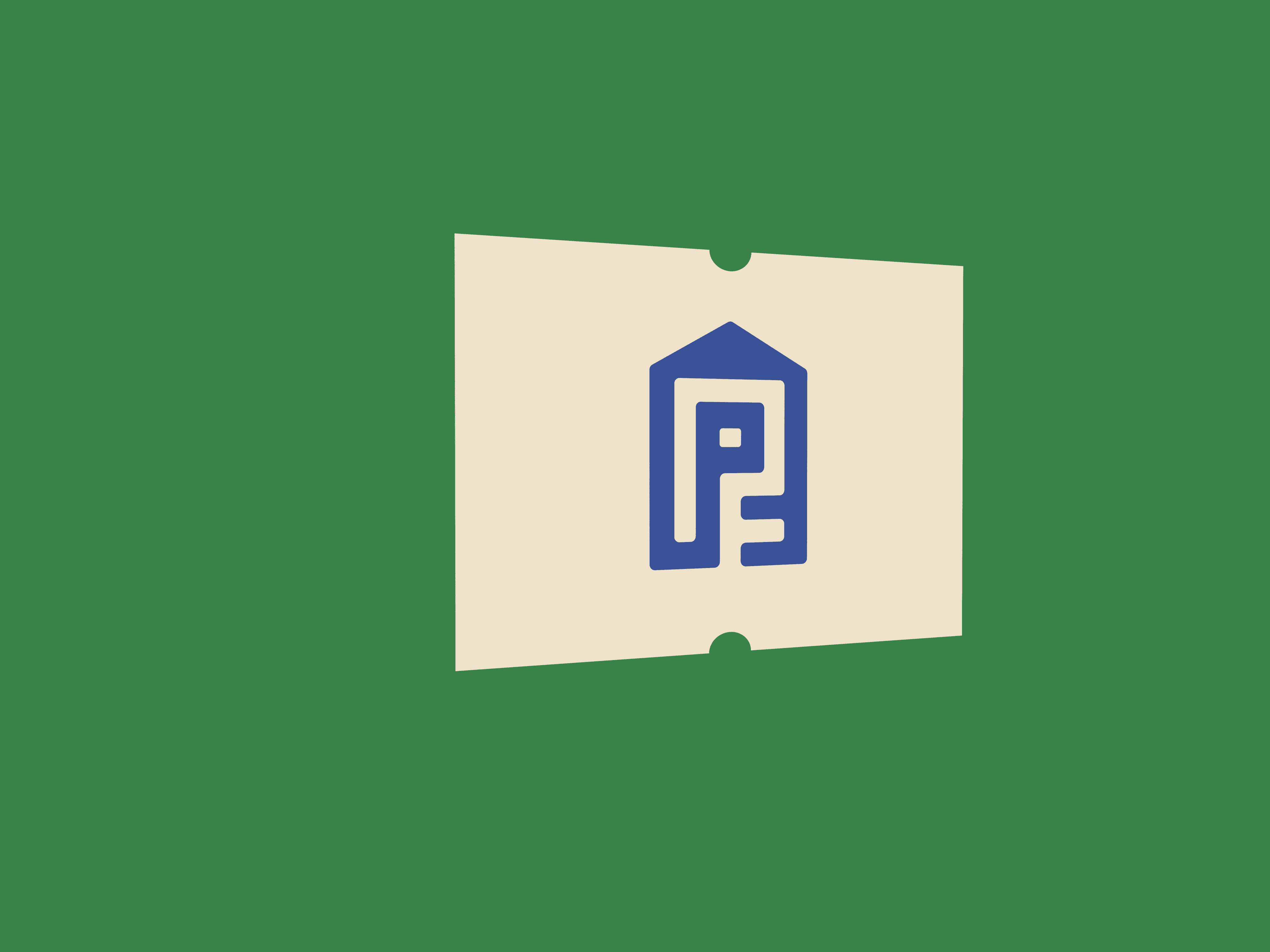
[New Logo; Pretzel Farm]
A refined Visual system


[Sketches of the initial designs for the icons]
Updating the story
Welcome to pretzel Farm: Pretzel Crisps


Quick cuts
I created these YouTube Shorts using Adobe Express, focusing on clear visuals, concise edits, and mobile-first design. Each short was an exercise in communicating quickly and effectively, without sacrificing style or intent.
So, What Did I Learn?
More Than A Logo
I realized a brand isn’t just a logo or a colour palette, but it’s the story. Every design choice I made had to reinforce the brand’s new personality, from the typography to the messaging.

Go big or go home
I took a big risk, but small tweaks wouldn’t cut it. I had to push past safe choices and take bold creative risks to make this rebrand feel fresh and exciting.

Strategy = secret sauce
I learned that great design starts way before the visuals. "Researching the market, competitors, and audience gave me clear direction before I even opened my design tools.

The power of iteration
Nothing great happens in one shot. I went through multiple rounds of refining, testing, and adjusting until everything felt just right. The process was hard I admit, but the final product was worth it.